
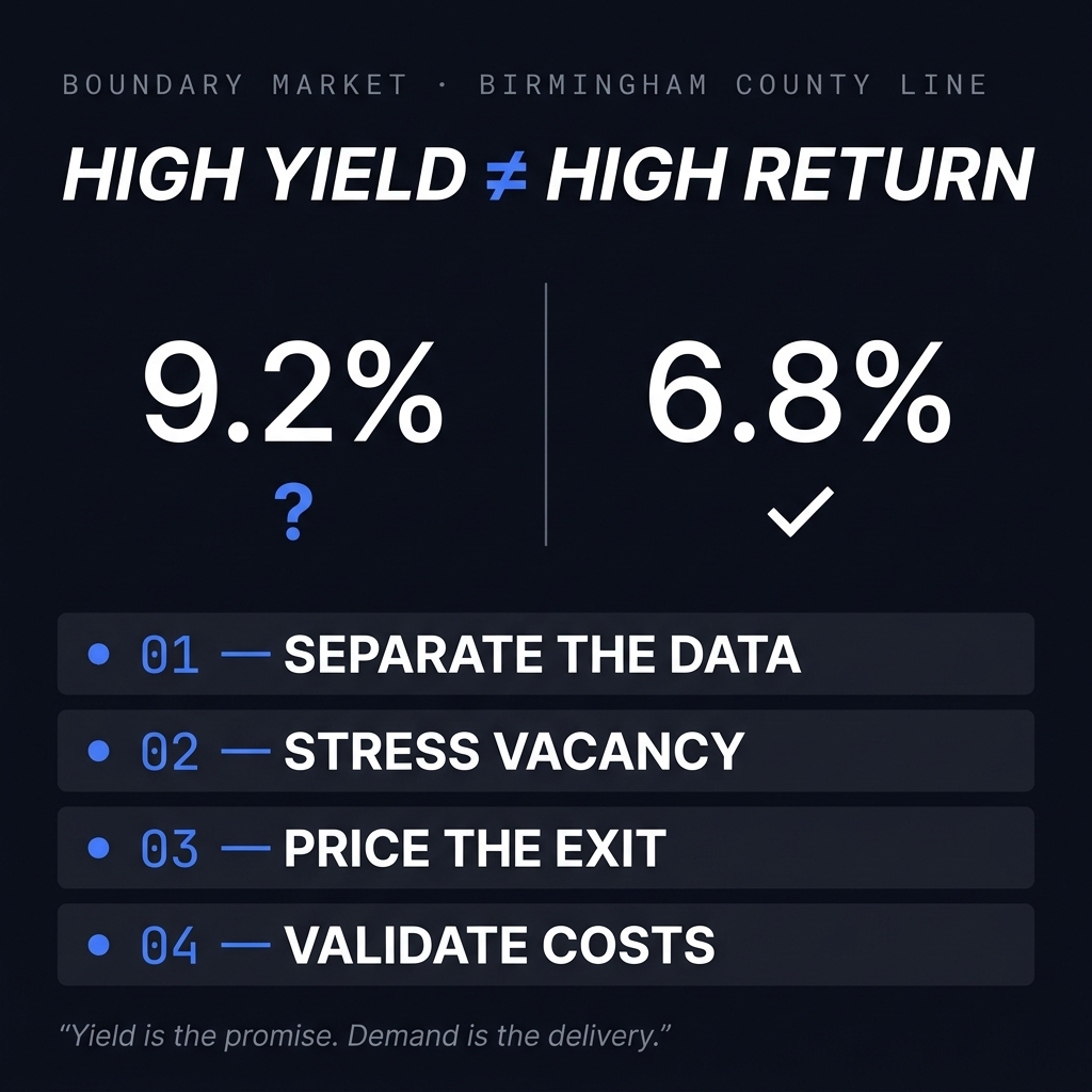
TL;DR: In Birmingham's boundary markets, the highest advertised gross yields sit in the lowest-demand ZIP codes. That inversion isn't an opportunity by default. It's a risk-pricing signal. This article explains how to evaluate it, step by step.
High gross yield in boundary ZIPs reflects demand risk, not hidden value.
County lines change school districts, tax rates, insurance costs, and tenant pools — often within a single mile.
Yields calculated with the wrong market's rent data are fiction with a decimal point.
Demand signals (pending ratio, days on market, rent-to-income depth) determine whether a yield is real or a warning label.
The boundary side can be the right buy — but only when leading indicators confirm demand is moving toward it.
Why Birmingham's County Line Creates a Data Illusion
A county line is an administrative boundary. Renters don't care about it. But every fundamental that shapes a rental market changes the moment you cross it.
School districts change. Property tax rates change. Permitting, code enforcement, and municipal services change. Employer access and commute patterns shift. Insurance pricing often shifts too.
The problem in investor analysis is that people blend data across that line as if it were one market.
They pull a citywide median rent, apply it to a property outside the boundary, and produce a yield number that describes a market the property doesn't actually sit in. It's a quietly common mistake, and it breaks the entire underwriting model.
A yield calculated with the wrong market's rent is fiction, presented with two decimal places.
Birmingham makes this concrete. A single "Birmingham median" of roughly $328K is a blend that averages a ~$102K house in Ensley against ~$635K homes in the Shelby County suburbs — a six-fold price range inside one number. It describes no house you can actually buy. The real urban-core value sits near $100–160K; the metro figure is a mix artifact, and anchoring rent or price assumptions to it quietly imports the wrong market into your model.
Bottom line: County lines don't just change the address. They change the investment thesis.
What Is the Yield Trap in Boundary Markets?
Gross yield is straightforward. Annual rent divided by purchase price. When price drops faster than rent, yield goes up.
The real question is: what causes price to drop faster than rent?
Birmingham draws the line cleanly. In Ensley (ZIP 35208, Jefferson County), a rental pencils at a roughly 14–18% illustrative gross yield — but Dynamic's demand score for that ZIP is 11 out of 100, on a market that takes about 66 days to move. Fifteen miles across the Shelby County line in Greystone (35242), the demand score is 83 and homes clear faster than the national pace — and the gross yield is about 3%. The highest yield and the real demand in metro Birmingham aren't just different ZIPs; they're different counties. You can't buy both in one house. (Demand scores are Dynamic's proprietary composite; treat yields as illustrative, FMR-derived, and top-line only.)
In boundary markets, the answer is demand. Fewer qualified renters. Longer days on market. Weaker school ratings. Thinner buyer pools at exit. The purchase discount is compensation for operational problems you're buying with the property.
There are three yield questions investors should evaluate separately:
Yield on paper: what the listing math says
Yield in practice: what you collect after vacancy, turnover, and maintenance
Yield at exit: what the next buyer will pay for that income stream
High-yield boundary properties often win the first question and lose the other two. Cheap houses tend to stay cheap for a reason, and vacancy is the tax that thin demand collects from optimistic underwriting.
Birmingham adds a twist worth naming, because it's the one the turnkey pitch depends on: in Ensley the yield is real, not a paper illusion. Actual 3-bedroom rents there (~$1,040–1,525) roughly match the fair-market rent behind the yield — unlike distressed markets where the advertised rent never materializes. That's exactly why operators market Ensley and West End to out-of-state buyers as "1%+ cash flow." The number isn't the lie. What the number hides is: a demand score of 11, a slow resale, a shrinking population, and an exit pool that leans on Section 8 tenants and other yield-focused investors rather than owner-occupants. Ensley can work as a deliberate, management-intensive, voucher-oriented cash-flow hold — but that's a specialist strategy with real exit risk, not the passive appreciation play the yield implies. (By contrast, Shelby's ~3% is FMR-based; at true high-end rent it's closer to 5–6% — still an appreciation market, not cash flow.)
Bottom line: A high listed yield is a starting point for analysis, not a conclusion.
Which Demand Signals Actually Matter?
When evaluating a property near a county line, start with demand — not yield. Demand is the constraint that determines whether the yield is real.
Days on Market, Side by Side
Compare how long rental listings sit on each side of the line, using properties within a mile of each other. A gap of several weeks confirms the renter pool changes at the boundary, regardless of what the map suggests.
Pending Ratio
The pending ratio compares homes going under contract to homes actively listed. It measures whether buyers are absorbing supply or supply is piling up. A boundary micro-market with weak absorption signals a slow exit before you've bought the entry.
Rent-to-Income Depth
A market where your target rent consumes a large share of local household income has a shallow tenant pool. Shallow pools mean longer vacancies and more concessions. Both erode the yield premium that made the property look attractive.
School District Boundaries
For single-family rentals, the school assignment often matters more than the county name. Families anchor demand in this asset class, and they choose districts. Map the district line before anything else.
Bottom line: Demand signals are leading indicators. Yield is a lagging one.
How to Underwrite a County Line Yield Premium
Here's the four-step framework for deciding whether a boundary yield premium is real compensation or a warning label.
Step one: separate the datasets. Pull rent comps and sale comps only from the property's side of the line. Mixing data across the boundary inflates rent assumptions and understates risk. This single discipline improves your margin of safety more than any spreadsheet refinement.
Step two: stress the vacancy assumption. If core-county underwriting uses a modest vacancy figure, the boundary property earns a heavier one. Rerun the numbers. The yield advantage often shrinks to less than a point, and an illustrative point of gross yield rarely covers a structurally weaker tenant pool.
Step three: price the exit before the entry. Ask who buys this house in seven years. If the honest answer is another yield-focused investor rather than an owner-occupant, your appreciation potential is capped by other investors' return requirements. That's a different investment thesis, and it deserves a lower entry price.
Step four: validate taxes and insurance at the parcel level. Crossing a county line changes both, sometimes materially. Paper yield advantages can disappear entirely once the correct tax rate and insurance quote replace the assumptions carried over from the wrong county.
The premium is only real after it survives all four steps.
Bottom line: Underwriting discipline at the boundary is what separates a good risk-adjusted return from an optimistic spreadsheet.
Where the Real Opportunity Sits
Boundary markets deserve real analysis, not blanket avoidance.
The interesting investment in a market like Birmingham's county edges is the block where demand is migrating toward the boundary while pricing still reflects the old map. Employers relocate. Road projects shorten commutes. A district rezoning shifts family demand a mile outward. When that happens, the demand side catches up to the yield side, and early buyers capture both cash flow and appreciation potential.
Finding that block means monitoring leading indicators. The ones worth prioritizing:
Rent growth accelerating on the cheaper side of the line while the expensive side flattens
Days on market compressing quarter over quarter in the boundary ZIP
Owner-occupant purchase share rising in a formerly investor-heavy area
Permit activity and infrastructure spending crossing the boundary
One quarter of favorable movement is noise. Several consecutive quarters is a trend worth underwriting.
Bottom line: The boundary side becomes a buy when demand is moving toward it — not before.
Investor Takeaway
Birmingham's county line splits one map into two markets. The yield spread between them is a price on demand risk. The investor's job is to determine whether that price is fair.
If the goal is durable cash flow with manageable turnover, the core-county side with the lower paper yield frequently produces the better realized return.
If the goal is buying ahead of demand migration, the boundary side rewards discipline — but only when leading indicators confirm the shift before capital is committed.
Either way, the process is the same. Separate the data by boundary, stress the assumptions, and price the exit before the entry.
Yield is what the listing promises. Demand is what the market delivers. Underwrite the second one.
Frequently Asked Questions
Why do boundary ZIPs in Birmingham show higher gross yields?
Higher gross yields in boundary ZIPs reflect lower purchase prices, not stronger rental demand. Price drops faster than rent because demand is thinner on the far side of the county line. The yield is the market pricing in that risk.
What is the pending ratio and why does it matter for boundary markets?
The pending ratio compares homes under contract to active listings. A low pending ratio in a boundary ZIP means buyers aren't absorbing supply. For investors, that signals a slow exit when it's time to sell.
Does crossing a county line really affect rental income?
Yes. School districts, tax rates, insurance costs, and tenant pools all change at the county line. An investor using citywide rent comps for a property across the boundary is modeling income from a market the property doesn't belong to.
How do school district boundaries affect single-family rental demand?
Families with children choose rentals based on school assignment, often more than neighborhood or county. A property on the wrong side of a district line faces a smaller, less stable tenant pool — even if the physical location looks similar.
When is a boundary market actually worth investing in?
When leading indicators confirm demand is migrating toward the boundary. Compressing days on market, rising owner-occupant purchase share, accelerating rent growth, and permit activity are the signals that separate early opportunity from a yield trap.
What does it mean to stress the vacancy assumption?
It means modeling a higher vacancy rate than you'd use for a core-county property. Boundary markets carry structurally thinner tenant pools, so a conservative vacancy figure produces a more accurate picture of net income and risk-adjusted return.
How can I validate the correct rent comps for a boundary property?
Pull comps only from the same side of the county line. Use listings within a mile of the subject property on the same side of the boundary. Mixing comps across the line inflates rent assumptions and understates the risk in your underwriting.
What is Dynamic.RE and how does it help with boundary market analysis?
Dynamic.RE is a market data platform built for single-family real estate investors. It lets you compare rent, absorption, and yield data at the ZIP code level, so your analysis reflects the actual micro-market your property sits in — not a blended metro average.
Key Takeaways
High gross yield in a boundary ZIP is a risk signal, not a value signal. Evaluate it as such.
County lines change school districts, tax rates, insurance, and tenant depth — all within a short distance.
Yield calculated with the wrong market's rent data is unreliable. Always separate comps by boundary.
Demand signals (pending ratio, days on market, rent-to-income depth) determine whether a yield is real or inflated.
Stress vacancy, validate parcel-level taxes and insurance, and underwrite the exit before the entry.
The boundary side can produce strong risk-adjusted returns — when leading indicators confirm demand migration, not before.
The discipline is the same on both sides of the line: separate the data, stress the assumptions, and price the exit first.
Run the Numbers Yourself
Boundary markets punish borrowed assumptions. Dynamic.RE lets you compare rent, absorption, and yield data at the ZIP level so your analysis reflects the market your property actually sits in.
Run your own property analysis with Dynamic.RE and turn market noise into investment clarity.
This content is for informational and educational purposes only and should not be construed as investment, legal, tax, or financial advice. Figures shown are illustrative estimates based on historical market patterns and assumptions that may not reflect actual results. Real estate investments involve risk, including possible loss of principal. Past performance does not guarantee future results. Conduct your own due diligence and consult qualified advisors before making investment decisions. Yield figures shown are illustrative, derived from HUD Fair Market Rents and listing prices, and are top-line (gross) only — they do not reflect vacancy, taxes, insurance, management, maintenance, capital expenditure, or debt service, and are not a promise or projection of returns. Verify ZIP-level rent comps and all expenses before underwriting any specific property.
.png)


